
Recalling the scales of a fish, this pretty oriental-inspired tile was originally composed of zelliges and was used to decorate fountains and other public buildings. It was in the 1920s that its rounded shapes and beautiful colours allowed it to become known. It was used and abused during the Art Deco movement before it fell into disuse in the 1930s. In recent years, this magnificent curvaceous tile has made a comeback in our interiors and not only in the bathroom where these scales sound obvious! In the kitchen, its curves are wonderful and contrast deliciously with the ambient rigidity. So if you want to bring a little touch of originality and modernity to your kitchen, the following should interest you …
- Hypnotic green
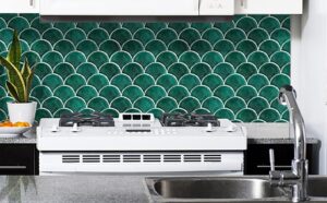
This Atlanta kitchen, clad in green bellies, offers a rather classic version of tortoiseshell tiles. But what strength emanates from this colourful wall in monochrome!
We like The full height pose and the hypnotic colour, which creates a real pattern and catches the eye. It’s as if nature with its organic forms has invaded the house!
- Precious copper
With its pretty pink colour, copper brings a chic touch to interiors, but when it is the kitchen splashback adorned with beautiful metallic scales, the light is also sublimated!
We like This pleasant shade which, less flashy than gold and warmer than silver, brings comfort and softness to the kitchen. It offers an interesting contrast with the ubiquitous vertical lines.
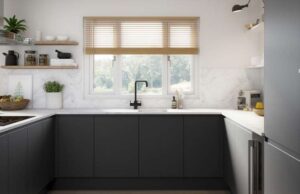
- Graphic pattern
To modernize this Parisian cuisine, all Art Deco codes have been used. Duck blue furniture, copper top and geometric pattern set the tone. And more particularly the two-tone tortoiseshell credenza, punctuated with gold, brings roundness, but also a certain chic to space.
We like This very contemporary revisit which makes it possible to sublimate this ultra-simple small kitchen.
- Magic mother-of-pearl
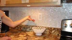
In this delicate Parisian cuisine, it is the sweetness that is highlighted. The powder pink furniture and the pearly backsplash, by playing on tones on tones, also allow the space to stand out!
We like The play of light that emerges from its enchanted scales. While blending into the decor, they bring relief and softness to the room.
- Ultrachic black
Wood and black in a kitchen complement each other perfectly. If the black allows the wood to gain in elegance and modernity, the wood brings that little extra soul which warms the black and allows to break the rigour. But in a kitchen where it’s all about geometry, a little roundness can be in order.
We like The black tortoiseshell splashback, which brings a welcome subtle roundness. It gives the place a little life with its organic forms.
- Discretion assumed
In decoration, simplicity is preferable to complexity, and it’s often the little details that make the difference. As delicately demonstrated by this pretty Parisian cuisine, which gives pride of place to materials. With its tone-on-tone tortoiseshell credenza, it combines simplicity and efficiency. Since the latter catches the eye and allows it not to go unnoticed.
We like Its rounded or copper-coloured accessories, which contrast with the lines of the furniture and reinforce the elegance of the place.
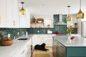
- Poetic gradient
Green is undoubtedly a magnificent colour in a kitchen since it allows nature to enter into interiors in a totally imaginary way. And in this kitchen, to say the least, this delicate shade of tortoiseshell tiles will not make us say the opposite.
We like The airy patterns reminiscent of tender foliage rather than aquatic elements. They blow a nice fresh spring wind.
- Sublimated blue
To break with the very rigid lines of this all wood and blue kitchen, the splashback here plays tones on tones in a fish scale version. Only small golden touches catch the eye and the light, to make the whole vibrate like never before.
We like: The scales placed upwards, randomly. They seem to want to escape. They reinforce the natural and airy side of this cuisine between sky and sea.
- Pop mix
While tortoiseshell tiles, with its rounded shapes, break the monotony of any kitchen, don’t forget that mixing colours can also be your ally. In this kitchen, the credenza plays with complementary contrasts to add a twist.
We like The hint of yellow that catches the eye and helps revitalize this relatively classic cuisine.
Author Bio:
Artisticks have created a wide and winsome range of murals, sculptures, artisticks pooja room door, the main doors, pooja room designs, that can be used by architects and interior designers.